Friday 22 March 2013

Evaluation 3:


What have you learned from your audience feedback?

I found that using social networking platforms such as Facebook and Twitter allowed me to obtain good audience feedback, in the form of comments. In addition, I decided to video a focus group's initial reaction to my music video, and allow them to provide comments once the video had finished playing.

To begin, a focus group was created by myself and partner, on Facebook on the 21st November 2012.


I created a rough draft of my digipak and magazine advert. I decided to produce my ancillary texts based on the genre conventions I had previously researched within my research and planning stage. Once produced, I decided to upload the pictures onto my facebook focus group and ask for feedback regarding the style, imagery, and layout of design.

This is the original template for my magazine advert that I created using Photoshop and images I discovered online. It was created to display the colour scheme I wished to carry throughout my ancillary texts, and represent the lipstick/lips motif. The informal font portrays the urban edge, along with the font colour- bright pink. 


I then searched for different fonts using www.Dafont.com, and discovered a font relevant to my genre. I downloaded the font, typed the name of my track's artist (Tanya Lacey) and uploaded it to facebook to gain feedback regarding the style. Focus group member, Abbie, stated that the font was relevant, and looked 'almost barbie like', which connotes femininity and playfulness; two themes I initially wished to portray throughout my video and ancillary texts. I therefore decided to use this font for my magazine advert and digipak.

 
I decided to create another magazine advert, as I was not pleased with my original.
 
 
I uploaded this JPEG image to my focus group on Facebook.
 
 
I took this feedback on board, and decided I'd remove the bold, black box for my final magazine advert. The font is the same font mentioned previously, taken from website :www.dafont.com.
 
 
Abbie has stated that the facial expression connotes themes of playfulness and fun. This was my initial intention, and therefore planned to maintain this concept throughout my ancillary texts and video. Regarding the feedback concerning the colour scheme, I decided that the light pink font was not bright enough to connote playfulness. I wanted the font to stand out, and contrast with the surrounding imagery.
 
After receiving this feedback, I decided to begin my final draft of my magazine advert; taking on board the critique and suggestions. This time using photographs I have taken of Thea with a DSLR camera. 


As suggested by Will (a fellow media student and member of my Facebook focus group), I decided to avoid  a bright colour scheme, however, felt the bright pink font was relevant to the genre, thus being redundant, and therefore wished to keep the bright font. I did however, download a different font from www.dafont.com, called 'Reklame Script Regular', as it is informal, thus inkeeping with the 'urban feel' of my genre. A more formal font would have misconstrued the concept of my ancillary texts, causing it to lack the 'contemporary' look. 

The only colours visible are bright pink and green (only on the cigarette). Will's feedback regarding the colour scheme as 'tacky' encouraged me to edit my photos in black and white, creating a stark contrast with the bright pink font. I felt this was more effective, as it is more bold. The black and white also makes it look somewhat 'classy', which is rather entropic of my genre- pop/contemporary rnb.

This is the rough draft of my digipak that I created before obtaining any audience feedback. There is an array of facial expressions, and I decided to follow the concept displayed in my magazine advert of using colour for lips only, as to maintain a colour scheme/pattern throughout my ancillary texts.


I decided to describe the concept of my digipak, magazine advert and eventually, my video (which I was yet to create) using this focus group on facebook, in hope that members would comment on my posts.


I then went on to display this, by uploading photos of my ancillary texts.


We decided to use a HDMI camcorder to film some members of our focus group watching our finished video, and providing feedback.


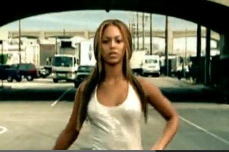
Some questions included- 'what did you think of the synaesthesia', to which, Abbie answered 'really good, its edited really well'. Another member commented on the entropy of our video, clarifying that we had achieved entropy through certain shots within our video, in particular, the shot of Thea 'running away at the end'. I went on to explain that our intention was to create a music with a lack of narrative, as to maintain a balance between the redundant and entropic conventions of an rnb/pop music video. Another member, Charlie, commented on the editing effects we had used to 'blend' two shots together, adding a fluid element to the video and in certain areas, connoting a theme of sexuality.
 
 
The intention here was to emphasise the red lipstick, contrasted against the black and white background. This again displays the visual motif we aimed to portray throughout the video and my own ancillary texts.
 
Zoe, another member, stated that regarding the editing of our video, 'the flashes were really nice', and therefore implying that they were redundant of the genre, and fit the video well. Charlie commented on the voyeuristic techniques we used to represent Laura Mulvey's Male Gaze theory, where Thea is featured with an empty photo frame around her head.
 
 
Zoe also commented on the body shots that represent the Male Gaze, proving that they were sufficient enough to be recognised as a technique to implement this theory.
 
When asked if they thought our video 'represented our genre well', Abbie claimed that she believed we had achieved this by displaying many different conventions of our genre, such as 'fast editing', 'male gaze', 'lots of different visual effects; black and white', and as a result of this, regarding the intended target audience, Zoe later stated that she believed our video was intended for, and made appropriate for girls aged between 13 and 18, which is predominantly true.
 
I decided to ask my focus group a question about uses and gratifications, in particular
 
 'what uses could you see the audience making of that?'
 
In response to this, Abbie stated that young females may wish to copy the style of clothing/fashion that is portrayed throughout the video. Charlie claimed that it may simply be a clear representation of people Thea's age, giving an insight to the playful nature of girls aged between 16 and 20. I'm pleased that this has been the majority's perception, as these were our ultimate intentions for the video (to display style and represent the culture of teenage girls, connoting playfulness and fun, with hints of sexual connotation).
 
I went on to ask the focus group more questions regarding the entropy/redundancy of the video. As mentioned previously, the ending of our video was perceived as entropic, and here, Zoe claims that it didnt 'fit' the video. This was also an intention, as we had planned to disregard a narrative/story within our video, as to add entropy. Furthermore, Abbie claimed that our video displayed 'a bit of both', which was also the intention from the early stages of planning. The shot of Thea with a cigarette in the car was considered entropic, this is an important shot and we are pleased that it has been noticed, as we aimed for this specific shot to draw a line between the girly/playful connotations and themes thus far within the video, and the rebellious/non-conformist themes which we wished to incorporate into it. Zoe believed that it was important to maintain redundancy, as did we, as it allows the genre of music to be recognised- a necessity for our target audience.
 
This piece of feedback taken from my Facebook focus group regards the uses and gratifications aspect of my video. It is safe to say that my audience use my video for pleasure, as a member states that she 'appreciated the humourous touches, such as the face pulling'. The audience use my video as a diversion- something playful and fun that is easy to watch and doesnt hold much meaning (displayed through a lack of narrative). It genereated discussion, especially between my focus group, and also between my own friends, as they watched it and sought enjoyment from it. The fun, humour, and conventions of style and fashion were highlighted the most by my focus group and peers, which achieves my initial goal of creating an easy-to-watch video that encourages a passive audience to simply seek enjoyment in the form of mild humour. There is clear indication that the fashion sense of Thea in our video and ancillary texts could be desired by my target audience, meaning they have used it for personal identity.


More feedback taken from our focus group, regarding our finished video- this piece of feedback is important for relating to our target audience. It clarifies that we have appealed to early teens-early twenty year olds, which was our main focus when discussing target audience.


 Overall I have discovered that my focus group liked these particular features within our video:
 
- the fast editing
- the synaesthesia and lip syching
- the entropy embedded into the video through random shots
- the red lipstick motif
- the sexual/playful/rebellious/fun themes and connotations
- the style/fashion of our model, Thea
 
within my ancillary texts, my focus group liked:
 
-the font
- the colour scheme
- the red lipstick motif
- the contrast between the black and white photos and red lips
- the fashion/style of our model, Thea
- the layout of the magazine ad (landscape)
 
 
There were certain elements that my focus group did not like. For example, regarding my magazine advert, a member from my focus group on facebook felt that I should have used only one font, as two fonts may add informality, unfortunately making the advert look unprofessional on some levels. I would rectify this now by sticking to only one font- the font downloaded from www.dafont.com called Reklame script. 


 Regarding my digipak, suggestions for improvement regard the colour scheme...


In order to rectify this, I would have only used the history brush tool on Photoshop to recolour Thea's lips, as they are the visual motif of all my ancillary texts and video.
 
Theorist, Stuart Hall, stressed the role of social positioning in the interpretation of mass media texts by different social groups. It involved encoding/decoding; the way in which an active audience percieve media. Hall's three reception models include the dominant model, where the reader fully shares the text's codes and reproduces the text's meaning- this may not have been intended by the author, in such stance, the code seems perhaps natural, or transparent. The second model is the negotiated reading, where the reader partly accepts the text's codes but sometimes modifies it in a way which reflects their own position, experiences and/or interests. The final model of Stuart Hall's reception theory is the oppositional model, where the reader understands the text's codes but rejects this reading, taking an oppositional approach, and distinguishing that they are not a passive member of the audience. I believe that my audience fit the role of the dominant model-readers, as they are usually passive in the sense that they accept all meanings of my video and ancillary texts, as the video/ancillary texts represent a generic pop/rnb culture, where meanings only run as deep as fashion, style and humour. It encourages for a totally passive audience who simply watch/see the video/ancillary texts in order to gain pleasure.
 
Uses and Gratifications: Theorists, Jay G Blulmer and Elihu Katz devised their Uses and Gratifications model in 1947 to highlight 5 areas of gratification in media texts for audiences. Three of which relate to my music video and ancillary texts; to entertain, a means of escape, and identification. As previously stated, due to the concept of fashion/style/humour and lack of meaningful narrative, my audience are more than likely to seek only escape and entertainment, however they are also likely to identify a part of themselves with the texts, as they can create a personal relationship with my model based on her fashion and style. As a result of this, it is safe to claim that my video/ancillary texts are Postmodern, as they were created with intention to promote the style, disregarding any substance/meaning besides mild humour. It can only be related to with regards to fashion and the appearance of the teenage culture (smoking represents rebellion, humour in face pulling etc); the video is only meaningful in such a way that it could influence my audience to change their lifestyles somewhat, to conform to the behaviour displayed within it by our model, Thea.


Friday 15 March 2013

Evaluation 2:

How effective is the combination of your main product and ancillary texts? (Digipak and Mag ad)

My idea was to produce a coherent package that carried a strong visual motif, thus creating a brand identity. The brand is a theme of sexiness, playfulness, rebellion and ultimately, fun. The visual motif I devised was an extreme close up of lips/lipstick. I aimed for my main product and ancillary texts combined, to attract my target audience of teens, age-ranging from 13 to mid-twenty year old girls and boys. The motif of red lipstick enabled my video and ancillary texts to attract my audience for various reasons- firstly, the brightness of the lipstick creates a redundant pop/contemporary rnb element, allowing my female audience to relate to the video/texts regarding fashion and the pop culture. Also, her visible nose stud connotes youth and a rebellion- a notion of non-conformism. It also connotes the fashion sense of this generation, and would undoubtedly appeal to my target audience.


Secondly, the use of red lipstick and extreme close ups was intended to relate and attract a male audience too- through the use of Laura Mulvey's theory of Male Gaze, and an attraction to the model.

Here, Thea is featured in an extreme close up, seductively licking her lips. This displays intertextuality- as Graham Allen claims 'it foregrounds notions of relationality', and 'every artistic object is so clearly assembled from bits and pieces of already existent art'. I have also edited the shot in black and white, to match Azealia Banks' shot, inkeeping with the musical genre and brand. I feel that Azealia Banks' brand is similar to my own that I have created for Thea, as she clearly displays elements of fun, rebellion, playfulness and sexiness.


My video


Azealia Banks- '212' (above)

It is important to create a brand identity when producing a music video, magazine adverts and a digipak for many reasons. Firstly, it is something that can be recognised and ultimately associated with the product. For example, my brand identity is presented well, in the sense that it reflects the latest style and designs related to my musical genre, inkeeping with the urban 'feel'. The red lipstick featured throughout my products contrasted with the black and white shots used for the digipak and magazine advert in order to stand out, and be noticed and recognised by my target audience.

Playful: Below, the shot features Thea putting lipstick on at the beginning of the video. It intends to portray sexiness, in conjunction with the playful element of Thea sticking her tongue out to the camera, posing through a black frame. This is the initial creation of the brand. Also, it features voyeurism, again touching on Laura Mulvey's theory, where she believed that women 'being captured in this gaze are valued primarily for their ability to be looked at. This was the intention of blending the two camera shots using Adobe Premier Pro editing software- allowing for two shots of Thea to be seen, one connoting sexiness (applying lipstick), and the other connoting a more playful aspect.


Rebellious: Below, the shots feature Thea pulling her hood up in time with the beat of the track, thus using Goodwin's Synaesthesia of linking image with time of music, and Thea rolling a cigarette. The hood and cigarette both connote rebellion and non-conformist attitute to society. This creates a brand, something that can be recognised and associated with my musical genrem and ultimately, Thea, as she is the main focus, and only character within my video.


Rebellion is also displayed in my magazine advert (Below, left) where Thea again, smokes a cigarette. The only visible colour is that of her lips, the bright red visual motif I have carried through my products. (Below, right) The front cover of my digipak, featuring only Thea's bright red lipstick conveying sex appeal.


Fun: Below, Thea is featured pulling odd faces and unchoreographed dance moves. This adds an element of fun, an aspect of my video that adds to the overall brand, inkeeping with the redundant conventions of my musical genre.


Below features my digipak, a shot of Thea that connotes fun and playfulness, using red lipstick again to add sexiness. Her nose piercing connotes rebellion, and a non-conformist attitude toward society. I decided to include the colour of her sweater aswell as her lips by using the history wand tool on Photoshop. The colour adds fun, inkeeping with the brand I have created.


Below- Azealia Banks' '212' video, unchoreographed dance moves connoting playfulness and fun, contributing to the brand of her video, similar to my own. Element of sexiness is also featured, as she is wearing shorts; revealing the majority of her leg.


Below- Rihanna's 'Rudeboy' video, featuring playfulness, fun, and sexiness with the use of bright colours (attire and background), revealing clothing, and provocative dance moves, mainly consisting of her lower region (bum).


I decided to replicate this feature of The Male Gaze with Thea, in order to add redundancy and sexual appeal to my video, inkeeping with the elements of the brand. Below, the camera shot is a close up of Thea's bottom. She is wearing tight jeans, again adding to the sexual element of the brand. This shows intertextuality again, regarding the aspect of provactive dancing, which is a mimic of Rihanna's, however Thea's clothing isnt so revealing.


If my product were to go on sale, it would more than likely be placed in the urban/rnb section of a CD shop such as HMV. This is because the majority of the elements of the video and the song itself feature redundant conventions of this musical genre. It would ideally be promoted in a music magazine such as 'VIBE', as it appeals to my target audience more so than magazines such as NME and The Rolling Stones; the genre being the main cause of this, also the age and style of my model.

The locations of my products vary, for example- the shots for my digipak and magazine advert were taken on college grounds, in a wooded area. This was somewhat entropic, as this location bore no relevance to the genre of music, nor the style of costume my model was wearing.

Spetchley Woods- located next to college, in Worcester.


Shot of Thea taken in Spetchley Woods. The location is more likely to be associated with an indie/folk genre of music, not rnb/pop, allowing for it to become somewhat entropic.


Regarding props however, my model was featured in both my magazine advert and my digipak smoking a cannibis joint. This connotes rebellion and displays a non-conformist approach to society and legislation, (cannibis is illegal). It is also illustrative of the title of the track- 'Born To Fly'. I was intending to relate the word 'fly' to smoking cannibis, in a way of describing the effects of the drug. It was also a stylistic technique that I aimed to become associated with my model and in particular, the musical genre.  

 -Taken from the digipak

 - Taken from the video.


Friday 8 March 2013

Evaluation 1:

 In what ways does your media product use the forms and conventions of real media products?

To begin my research and planning, I looked at various bands and artists within the 'contemporary rnb/pop' genre of music. I watched many videos from artists such as Nicki Minaj, Azealia Banks, Rihanna and Tanya Lacey to attempt to understand the themes and techniques used to reflect the genre. My main focal point was the use of humour, and quirky choreography. Jump cuts, and Synaesthesia were the key camera shots and editing techniques that I found within these videos, and felt it essential to incorporate them into my own video. The videos were also very playful, with a lack of narrative. In my video I decided to rule out a strong narrative, and encourage a more playful, entropic theme throughout.


     These shots of Beyonce convey Laura Mulvey's theory of Male Gaze. (Right) the camera focuses on her breasts, and (left) her bottom. Both her cleavage and upper thigh area are visible.
I decided to incorporate Male Gaze into my own video, here featuring Thea bouncing on a ball in the gym. There is no narrative structure, or reason behind this shot other than for the purpose of creating The Male Gaze- much like Beyonce (above). Her midriff is in plain sight, made visible by revealing clothing. The action itself of bouncing on a gym ball holds much sexual connotation.


Here features an extreme close up of Rihanna from her 'Rudeboy' video.


Above, Rihanna's mouth displays a pout that represents attitude, as if snarling at the camera. Her red lipstick creates a visual motif- something which inspired and encouraged me to use in my own video.


Taken from my digipak, Thea's bright red lips contrast with the black and white edited background in order to make them stand out. Rihanna's snarl/pout (above) connotes attitude, and I have decided to incorporate this redundant feature of an rnb/pop video into my own video, displaying Thea's nose ring which connotes rebellion and attitude. It also portrays fashion, style, and sex appeal- much like Rihanna's.

Here, a shot from Azealia Banks' '212' video features black and white editing, and an extreme close up of her mouth. I decided to replicate this type of shot, displaying intertextuality, and portraying the 'urban' feel I had initially wanted to achieve during the planning stage, however decided to take close up shots as opposed to extreme close up shots. I thought it was a stylistic technique that adds variation to the colour scheme of the video, creating a sense of simplicity and stark contrast to other colours.


Within these videos I found that colour is a significant feature. Bright colours that 'pop' out of the screen, contrasting with black and white edited shots were redundant of my genre, and in order to make my own video relevant, I decided to incorporate both colour techniques into my own video and digipak/magazine advert. 
                                                    
                   Above, Rihanna's video is bright and colourful, also very redundant of her musical genre, adding a playful theme, connoting fun. Rihanna's clothes are also bright, vivid colours. I felt it important to replicate this image with Thea within my own video.

See below- Thea wears bright attire, inspired by the bright colours used in Rihanna's video. In addition, the background of the shot features an orange fire escape. This provides a bright colour to replicate Rihanna's shot above, and provides an urban feel, portraying 'city life'. I did however decide to position the camera at a slanted angle, as I felt this would help create even more of an urban feel, in the sense that the shot wasnt 'clean cut'. This is entropic of this particular music genre, as like Rihanna's, the majority of rnb/pop videos look clean cut, displaying aspects of symmetry and steadiness of a camera. The shot of Thea represents more of a hip hop genre.


This shot below is taken from urban/hip hop group, NDubz. It shows aspects of urbanity and 'city life', aswell as using a slightly slanted camera angle for a somewhat rougher, less clean cut look.


The colour scheme portrayed in all 3 of my products include black and white editing.

Digipak


Magazine Advert

Style features of my digipak, video and magazine advert include the glamorisation of smoking, which connotes rebellion and and a desire to be non-conformist with the laws of society. The informal font creates an urban feel to the video; connoting youth and the modern generation, a clear lacking of authenticity, and an attempt to create an individual look. Regarding the lack of authenticity, theorist, Lyotard, discussed the death of the meta-narrative; the notion that originality is dead, everything is a replica of something already produced, and there is a significant lack of meaning. I believe I have incorporated this into my products, as they do not display a narrative. It is intertextual, and simply a copied version of already-established videos.
 The colour of the font also supports this, as it is clearly bright pink- connoting youth again, aswell as showing some female dominance within the musical genre, and in particular, these media texts that I have created.


Nicholas Abercrombie's theory entailed the exploitation of genre conventions, and the economical benefits of reusing props, costumes, sets etc. I have certainly displayed this within my media texts, as the model's attire lacks extravagance, and all costumes belonged to her already- I did not have to purchase new attire for the shoots. 


Costume is an extremely important feature in music videos of the 'contemporary rnb/pop' music genre. I ensured that my model's attire was similar to the artists within my genre. I discovered that as both the artists and their fans wear bright clothing (often revealing), thus deciding to ask my model to wear bright clothing. Regarding the 'revealing clothing', there were some shots within my video that were intended to represent the Male Gaze, a theory devised by Laura Mulvey. These shots were undoubtedly redundant of my specific music genre, despite the narrative behind it being entropic. (Medium Close Up shot of my model working out in the gym...Male Gaze is evident as the camera focuses on her midriff). Mulvey also suggested that the narrative of a video was more likely to follow narratives centred around male desires. The female form is a male desire, hence why I decided that using Male Gaze would be so beneficial.


A specific shot in Azealia Bank's music video for '212' features a dance that was not choreographed. It was quirky and playful- two themes that I aimed to use in my video. (13-15 seconds in).


I replicated this type of dance in my video, which I also edited in black and white. Steve Neale's genre theory of repetition and difference is relevant to my video, as I aimed to copy the style and editing technique, however, I didnt wish to use it as a main feature. The shots where my model dances in this way are very short clips that display Synaesthesia, a term coined by Andrew Goodwin, who saw the importance of linking the time of the beat with the camera shots, aswell as lip synching, which were things I intended to incorporate into my video from the early stages of planning.


My video- Tanya Lacey's 'Born To Fly'.  Lip Synching is evident throughout my music video, similarly to Azealia Banks' '212'.


It is crucial that genres have to repeat certain conventions in order to be successful, as it essentially brands the video, allowing the audience to associate it with other videos, thus increasing popularity and eventually, sales. I have repeated conventions such as the unchoreographed dance moves, black and white editing, and a visual motif of red lips aswell as bright clothing and use of Mulvey's Male Gaze in order to allow my audience to relate videos using these conventions. I decided against, however, repeating all conventions of my music genre, as I felt the audience would get bored with the redundancy of the visuals within the video. I decided to create a video that lacked any strong form of narrative, to ensure that the audience would not know what shot would come next, allowing it to be somewhat unpredictable; therefore entropic.

The effect of entropy on the audience is significant, as despite many elements of my video being redundant of the genre, certain entropic elements add a sense of the unexpected. I wanted the audience to feel as though the video is perhaps unpredictable, in the sense that they can pick up on the synaesthesia, but unknowingly anticipate what the next shot will entail. For example, some of the
filming took place in a local gym.

 <---- Nunnery Wood School. The Gym is located inside.
                                                  

This is a somewhat entropic location to shoot a contemporary rnb/pop music video. The shots purposely look out of place, fitting with the idea of a lack of narrative. I add redundancy by using lip-sync, a very common element of videos from this genre.

Another way in which I created an entropic twist to the video is by using stop-motion.


I created a stop motion sequence consisting of cupcakes being individually iced, spelling out the title of the song. It is illustrative of the lyrics, and the shot is synaesthetic. This is both redundant and entropic, as despite being illustrative, the shot looks out of place. I intended for this, as I felt it was important to create both senses of redundancy and entropy, without the final sequence of stop motion becoming amplific. Kate Nash, an indie/pop artist produced a music video that was both illustrative and entropic too.

Kate Nash- Foundations. This features a link between visual image and lyrics, but is not coherent with the narrative of the story behind the video- thus being a deteriorating relationship between boyfriend and girlfriend. It adds comic effect, something I did not directly wish to incorporate into this specific part of the video, but have used as a concept throughout my video and digipak.

"You said I must be sucking on so many lemons, because I am so bitter"


I have stuck to the initial idea of creating a video without a strong narrative throughout my video, despite embellishing the original plans of shot lists and storyboards. I feel that sticking to this concept allowed for both originality and creativity, without becoming either completely redundant or completely entropic. I aimed to create an auteuristic element, as I carried this notion throughout the video.

If I were to challenge the redundant conventions of a pop/contemporary rnb music video, it would ultimately lose value and appear too entropic- tainting the perception of it as a whole. The comic effect, quirky style, and added 'urban feel' allowed me to create a video that lay somewhere between redundant and entropic; fitting properly into neither category, in order to develop a balance between predictability and totally random. 

Another way in which I have allowed my video to display originality is through the use of camera shots. For most of which we utilised the camera tripods, but for some shots we felt it necessary and beneficial to use hand-held, in order to create a rougher, urban feel to the video, innkeeping with the typical conventions of the genre.

I took many stylistic techniques from Azealia Banks' 212 video, in particular, the comic effect.


Here, I have asked Thea to pull various faces, for the simple reason of adding humour to the video. It is fairly redundant, but adds a quirky edge, which I intended to create from the early stages of planning. The black and white edit, and slanted camera position add the urban feel to the video that I required. 


This pose connotes seduction, and adds a sexual theme to the video, inkeeping with the age and nature of my target audience, considering their age and preferred musical genre. The lips in general hold a connotation of seduction, thus being a reference to sex, and I have carried this throughout my ancillary texts and video in order to address my audience and add redundancy. The male gaze was motivated by Freudian ideas of sexual desire and so coded women as sexual objects in a voyeuristic and fetishistic manner. Lipstick is a known fetish for men, and clearly the fact that Thea is female encourages the male gaze. I feel adding the visual motif of red lipstick enables my video to appeal to men in this manner, and women would see the lipstick as an element of fashion/style, enabling my video to appeal to them too.