My thought process thus far:
# Female on the digipak-front.
# Bright colours, maybe some use of Pop Art.
# The performer looking directly into the camera, addressing the audience.
Here are some shots I intend to replicate:

Tanya Lacey is the artist of the track I am using for my music video. This shot is fairly redundant of her genre, however the visibility of her tattoos and jewellery give the shot a more entropic, hip hop theme. I aim to utilise this technique in order to create a more entropic shot, featuring either tattoos, piercings or jewellery. This is not a cover of a digipak, but a shot taken during a standard photoshoot for the artist.

Rihanna is of the same genre as my artist's track, and here she is clutching a Vogue magazine and smoking a cigarette. This is entropic of her genre, and I aim to use this concept in my own video. Her eyes are shut, thus meaning that she is not addressing the audience.

The graffiti in the background of this shot represents an urban theme, and is an entropic element of the genre, and Rita's attire and lipstick is bright and is redundant. This shot features both entropic and redundant features, and this is something I aim to reproduce in my own front cover for my digipak. This shot is not featured within her digipak. The location she is in is similar to the location I wish to use for my video, and have mentioned in my pitch. I like the pose she is doing for the camera; blowing it a kiss, as if directly addressing her fans/audience.
After analysing these pictures, I have decided that I would like to use a location similar to Rita's (a street and graffiti-covered wall) to have as the background on the front of my digipak. The performer will stand infront of it posing.
With regards to the inner CD tray of my digipak, I have a clear idea of what I wish to do.
# I will use greyscale/black and white camera setting when taking the shot.
# I will use the performer displayed on the front of my digipak.
# I will use an extreme/close up of the performer.
I have researched some images that are similar to my idea.

RITA ORA- This is an extreme close up of Rita's face. This shot focuses mainly on her sunglasses, which portray the message 'Cross my heart, hope to die, stick a needle in my eye'. This is totally entropic of her genre, and a feature that I wish to use within my digipak. The redundancy within this shot is portrayed through the lipstick she is wearing, and the dyed-blonde hair she has. She is half-smiling at the camera. This image is very similar to the image I have in my mind of what my inner-cd tray will look like. It reinforces dominant ideology of a feminine girl who uses hair dye and make up. It can be perceived as connoting vanity, as it is such a close shot, which goes hand in hand with arrogance- something I originally wanted to portray in my video and digipak.
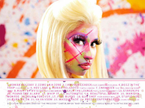
This is Nicki Minaj's tracklist. I aim to use bright colours like these, and a bright informal font for the tracks. I am still yet to decide whether I want to feature the female performer on my tracklist. In order to keep with the urban theme, I would like to use a location for the shot, not a photoshoot backdrop.
SOME IDEAS:
# Use a street wall for the shot, and add the tracks via photoshop, using a graffiti font.
# Contrast the colours of the dull background to the bright font.
# Display the tracks in note form.

This is Rita Ora's tracklist. I like the informal, hand-written font, and the colour scheme is simplistic. The lipstick stain and letter 'R' at the bottom right of the tracklist are motifs. In addition, the sunglasses at the top left of the tracklist are also symbolic of Rita's star persona, similar to the glasses featured in the shot I am using for inner CD tray inspiration.

This image of Rita Ora is taken from the inside-left of her digipak. All credits to producton and management etc are located at the bottom of the image, in a small plain font. Again, the colour scheme is predominantly black and grey, however the Record Label credit 'ROC NATION' is written in red font. This enables it to stand out against the greyscale background. I think using this technique in my own digipak will create a professional edge, drawing attention to the Record Label, connoting power and authority. I have been inspired to create a Record Label logo for my music video from this image.
No comments:
Post a Comment